A store that helps customers choose, not just browse products.
A hard-to-navigate Webnode store became a WooCommerce system with several ways to find products and automated back-office processes.
01 · Starting point
The challenge
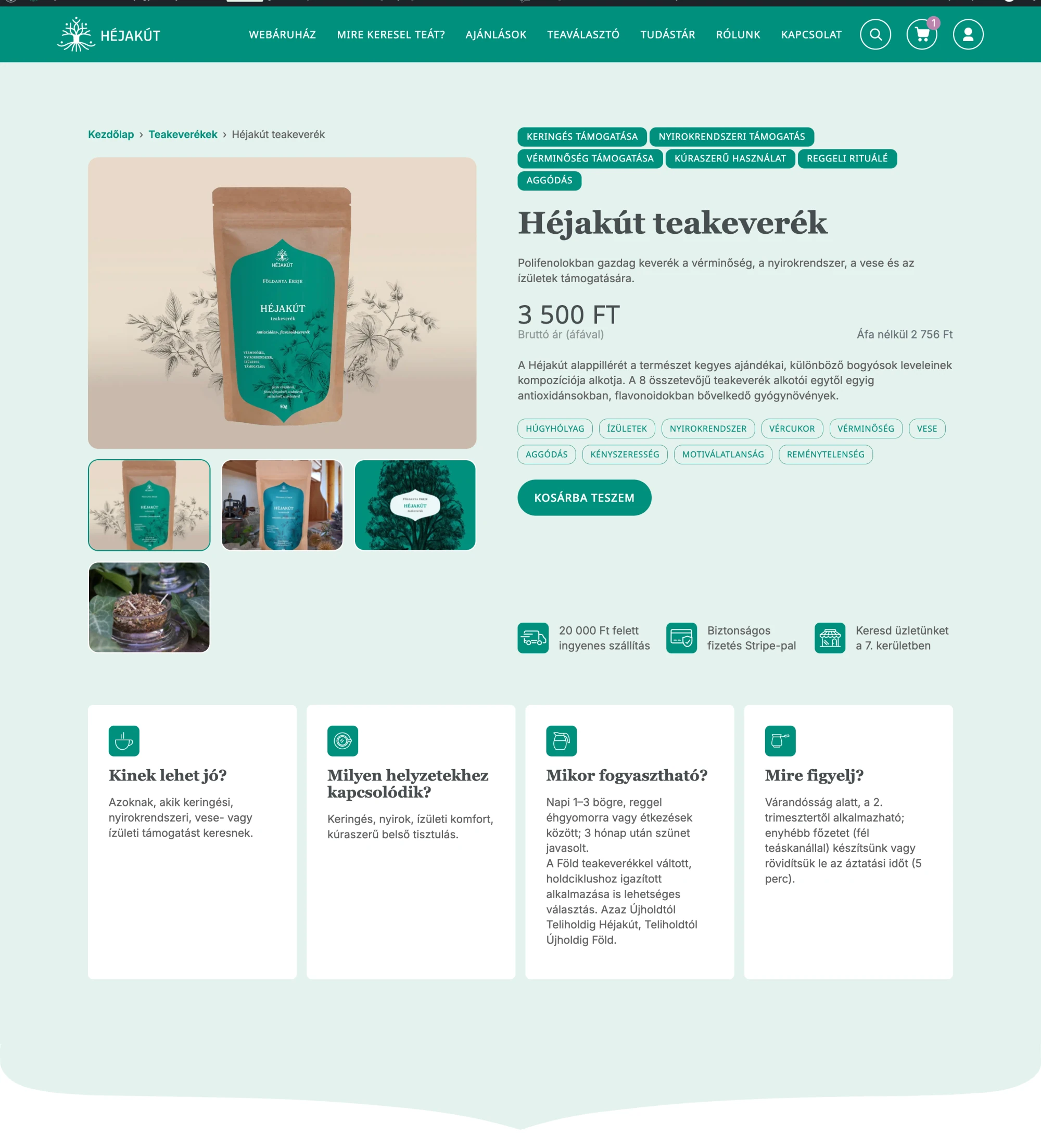
The old Webnode store had around 27 products, yet it was hard to navigate. Product pages mainly consisted of images and a long description, so visitors had to read every page to compare the range meaningfully.
Héjakút already had a richer product system, but the website barely reflected it. The old platform also limited automation.
Approach
I reviewed the site from a visitor's perspective, looking for the cues needed to help a newcomer find relevant products quickly.
The redesign began with wireframes. Together, we decided what content to keep, what new information layers were needed and how to strengthen marketing and SEO without losing Zsuzsi's distinctive voice. I then designed the UI around the existing brand identity.
02 · Design decision
Products became a system
Problem
Visitors had too few cues to identify a relevant blend without reading the entire product range.
Decision
We organised products using several criteria that make sense to customers and created multiple starting points on the homepage before the product list.
Solution
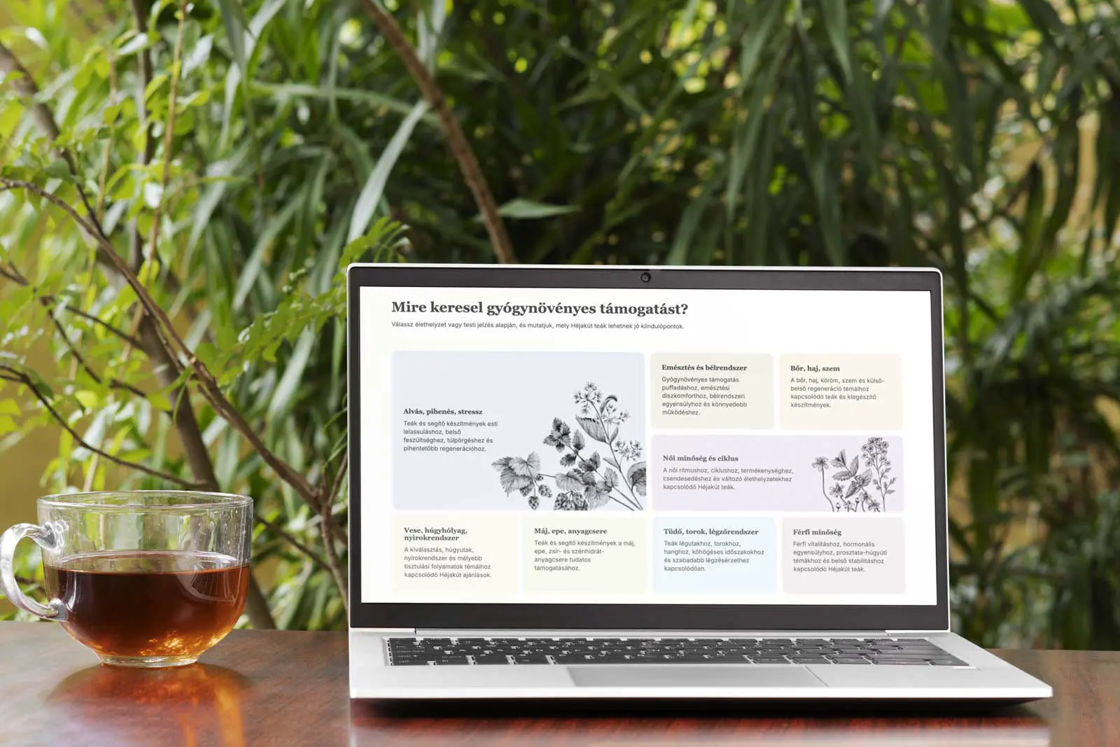
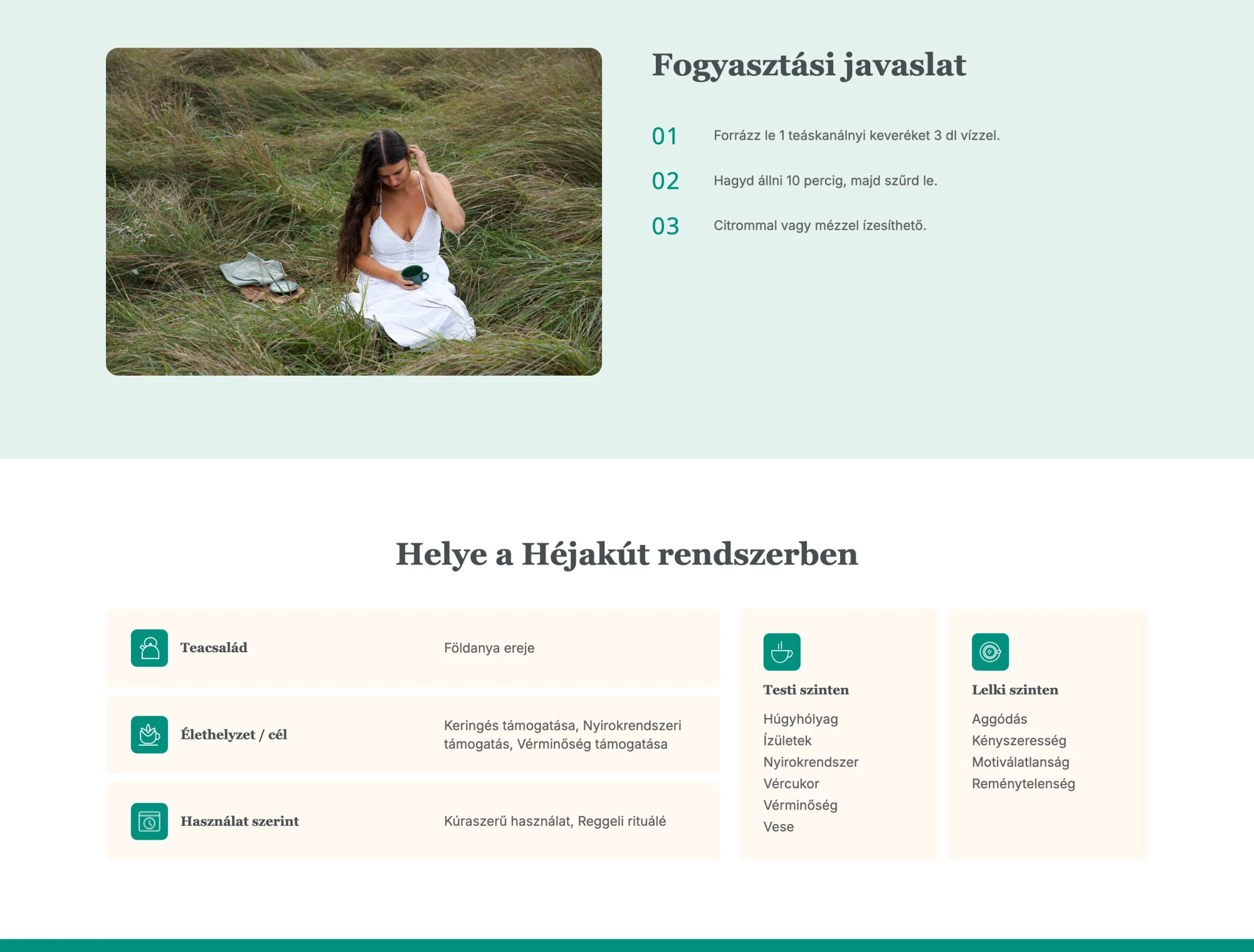
Customers can now find relevant products by concern, physical or emotional focus, tea family or an interactive selector.
03 · Process
Several paths to the right blend
Visitors arrive with different ways of thinking, so the store does not rely on a single categorisation scheme.
- 1
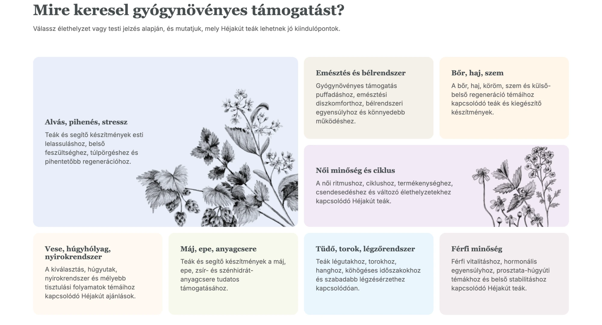
Concerns
Visitors can start with sleep, stress, the menstrual cycle, digestion and other needs.
- 2
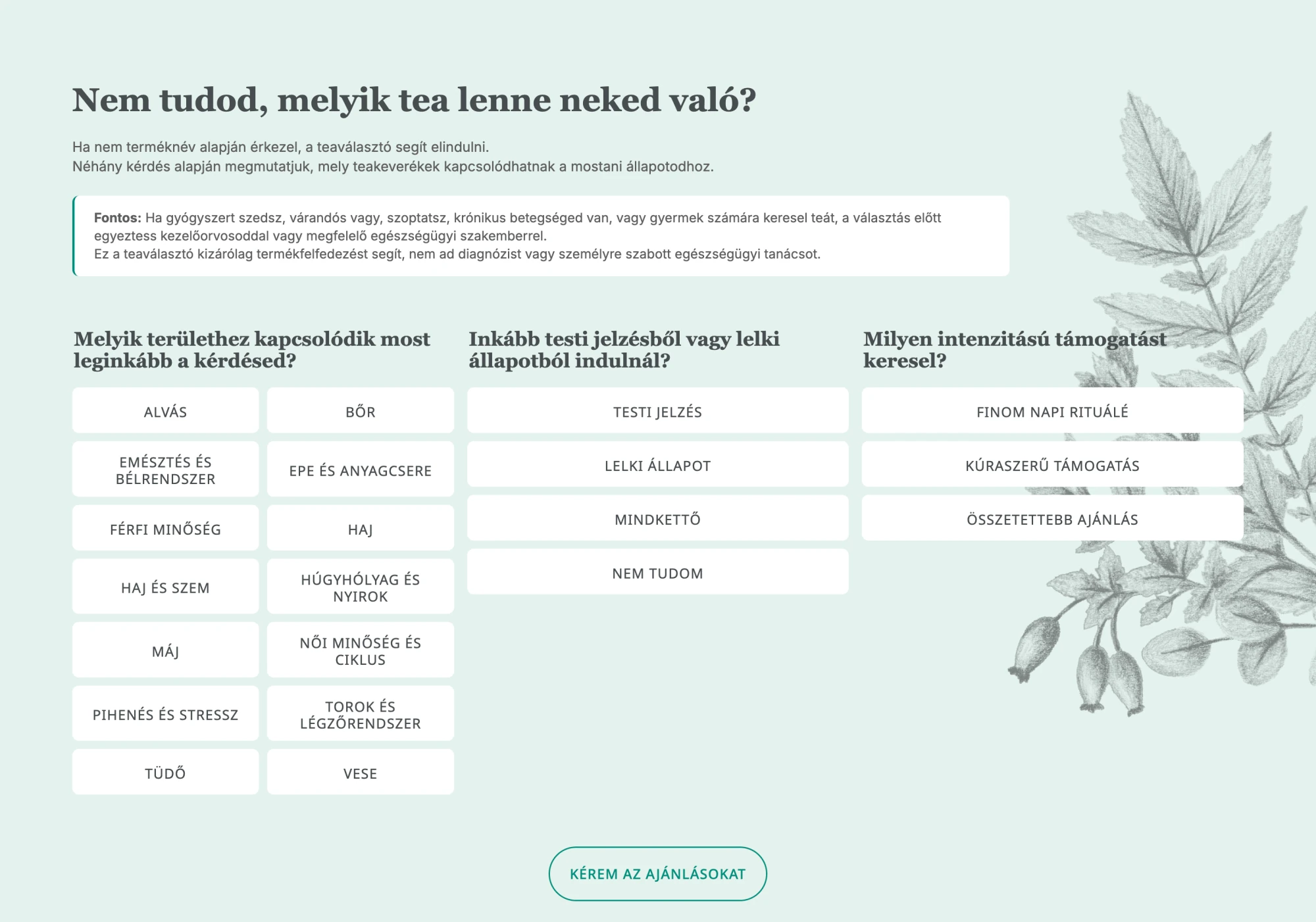
Interactive selector
Users answer questions about physical or emotional focus, specific concerns and the level of support they seek.
- 3
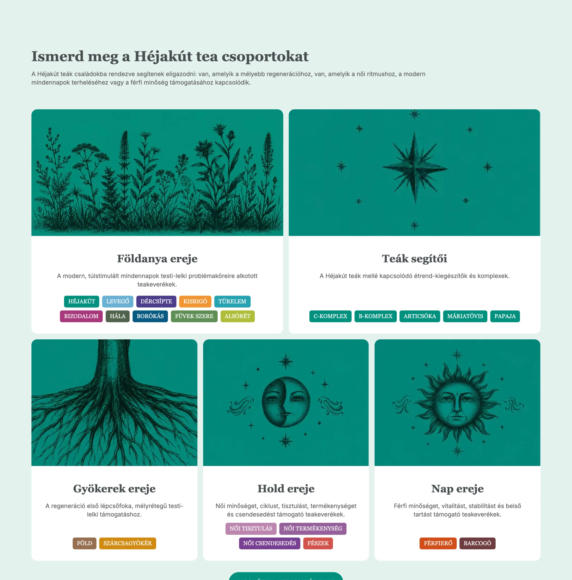
Tea families
The Roots, Earth Mother, Moon, Sun and Tea Helpers collections connect products from another perspective.

- 4
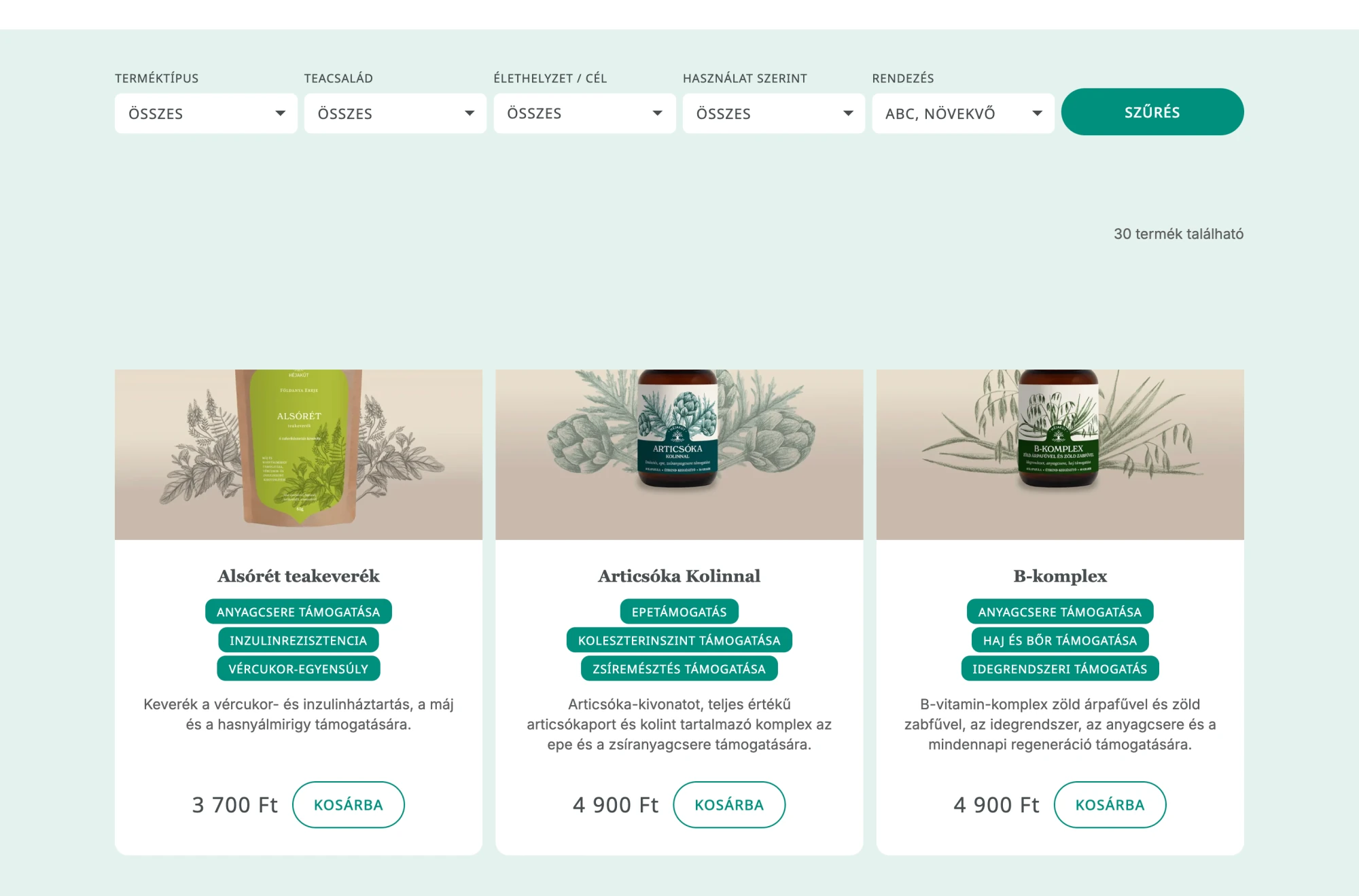
Traditional filters
Traditional filters remain available on the product listing page.

04 · Design decision
Keeping an authentic voice while rebuilding the structure
Problem
One of the old site's strengths was Zsuzsi's distinctive, recognisable voice. A heavily marketing-led rewrite could easily have lost that character.
Decision
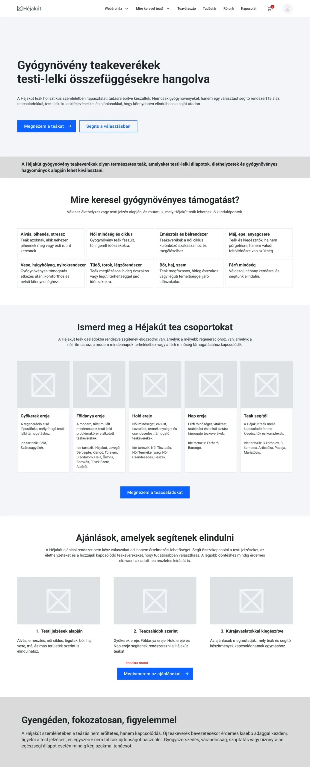
We used wireframes to make decisions together: what should stay, where new information was needed and where content could be strengthened for SEO or marketing.
Solution
The new site is better structured and easier to search while retaining the personal voice that makes Héjakút distinctive.
05 · Design decision
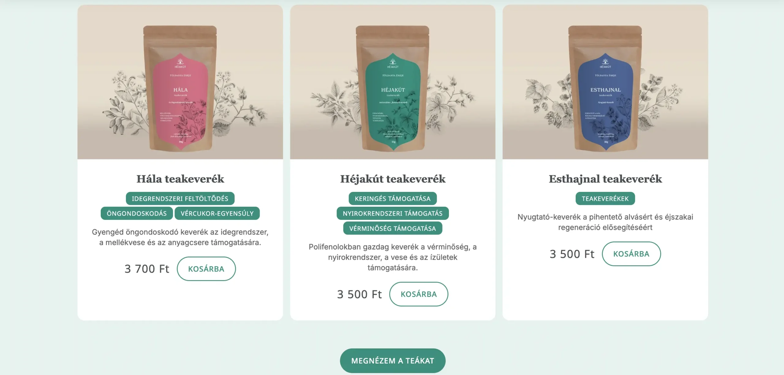
Turning packaging colours into a digital system
Problem
The website needed to connect visually with the existing identity and physical products.
Decision
Holló-Szabó Réka designed the existing identity and packaging. I aligned the website UI with her work, developing a digital palette and hierarchy from the packaging colours.
Solution
The store now feels like part of the same brand world.
06 · Design decision
Turning content without an export into structured WordPress data
Problem
Webnode offered no database export that would let us transfer product descriptions and knowledge articles easily.
Decision
I saved the relevant pages' HTML and used automated processing and AI tools to identify the content worth preserving.
Solution
The structured data became an import file for the new system. This greatly reduced manual copying while preserving the original copy.
07 · Design decision
Fewer manual steps after an order
Problem
The old store's technical limits left several processes manual or difficult to manage.
Decision
I configured WooCommerce so checkout and order management could connect to several external services.
Solution
The new system supports online payment, automatic invoicing, GLS shipping and parcel-point selection, and simpler shipping label generation.
08 · Design decision
A fast store with measurable performance
Problem
With new content, interactions and store functions, it was important to protect technical performance.
Decision
Performance optimisation and future measurement received special attention during development.
Solution
Measured performance scores exceeded 90. I also connected Google Analytics, Search Console and Merchant Center.
09 · Result
Result
The old store, built mainly around product descriptions, became a layered system that supports customer decisions. Visitors can explore by concern, physical or emotional focus, tea family or an interactive selector.
A more manageable, partly automated WooCommerce system replaced the old platform. Measured performance scores exceeded 90, and Google integrations were set up.
What challenge does your project need to solve?
If you are planning a new website or digital product, I can help shape its UX, design and technology into one coherent system.