Brand Identity and Design
What Does a Brand Identity Include Beyond a Logo?
A brand identity is much more than a logo. Colours, typography, imagery, graphic elements, and usage guidelines form a system that makes a brand consistently recognisable.
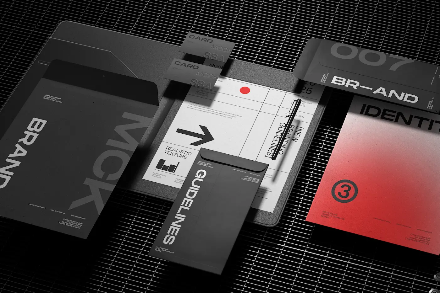
When looking for brand identity design, people often think of the logo first. That’s understandable: a logo is a visible, tangible element. But an effective visual identity goes much further.
A brand identity is a system. It combines guidelines and visual elements that make a website, social media post, presentation, printed material, or packaging feel like part of the same brand.
1. Logo and Logo Variations
Alongside the main logo, you may need several variations:
- Horizontal and vertical versions
- An icon or monogram
- Versions optimised for light and dark backgrounds
- A single-colour version
- A simplified mark that remains recognisable at small sizes
2. Colour Palette
A good colour palette is more than a few attractive colours. It helps to distinguish between primary, secondary, and functional colours, while ensuring sufficient contrast.
For websites, it’s particularly important to define background and accent colours, button colours, and the colours used for different interface states.
3. Typography
Typography has a strong influence on a brand’s personality. Beyond choosing typefaces, it’s worth defining a clear hierarchy for headings, body text, emphasis, buttons, and small labels.
4. Graphic Elements
A brand can become recognisable through elements beyond its logo: lines, patterns, geometric shapes, frames, textures, or illustrative motifs.
These can later form the basis of social media templates, presentations, or a website’s visual system.
5. Képi világ
The mood of your photography matters just as much as your colour palette. Clean studio photography, documentary images, warm natural light, and high-contrast black-and-white photography each give a brand a different character.
As part of brand identity design, I often define an imagery direction: the subjects, compositions, and lighting that suit the brand.
6. Icons and Illustrations
When you need to distinguish between several features or services visually, a consistent icon system can help. The key is to use icons with a shared visual style, rather than mixing unrelated sets.
7. Brand Guidelines or a Brand Board
Brand guidelines explain how to use the system. A concise brand board is often enough for a smaller business, while more detailed guidelines can be useful for larger organisations or when several people create communications.
Typical contents include:
- Logo usage;
- Colour codes
- Typography;
- Imagery
- Graphic elements
- Examples of correct usage and what to avoid
What Else Can Be Created from a Brand Identity?
- Business cards;
- Flyers or brochures
- Presentations
- Social media templates
- Newsletter designs
- Email signatures
- Packaging or labels
- Website UI design
Why Think in Terms of a System?
Over time, creating each new piece of design shouldn’t require starting every decision from scratch. A good brand identity provides a framework, speeds up the design process, and helps the brand stay consistent.
If you’re launching a new brand or want to bring more consistency to your existing visual identity, this is the approach behind my brand identity and supporting design services.